PERCHANCE THEATRE
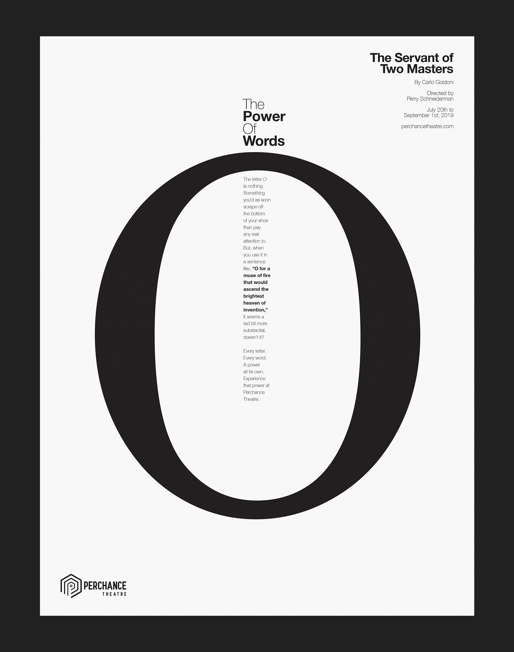
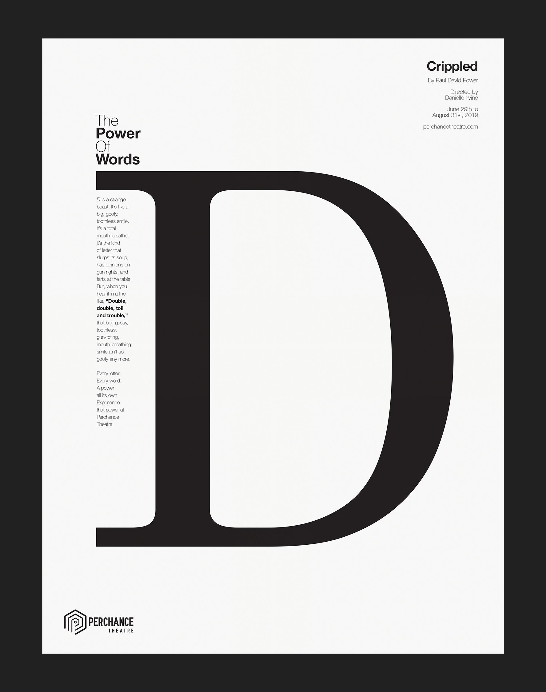
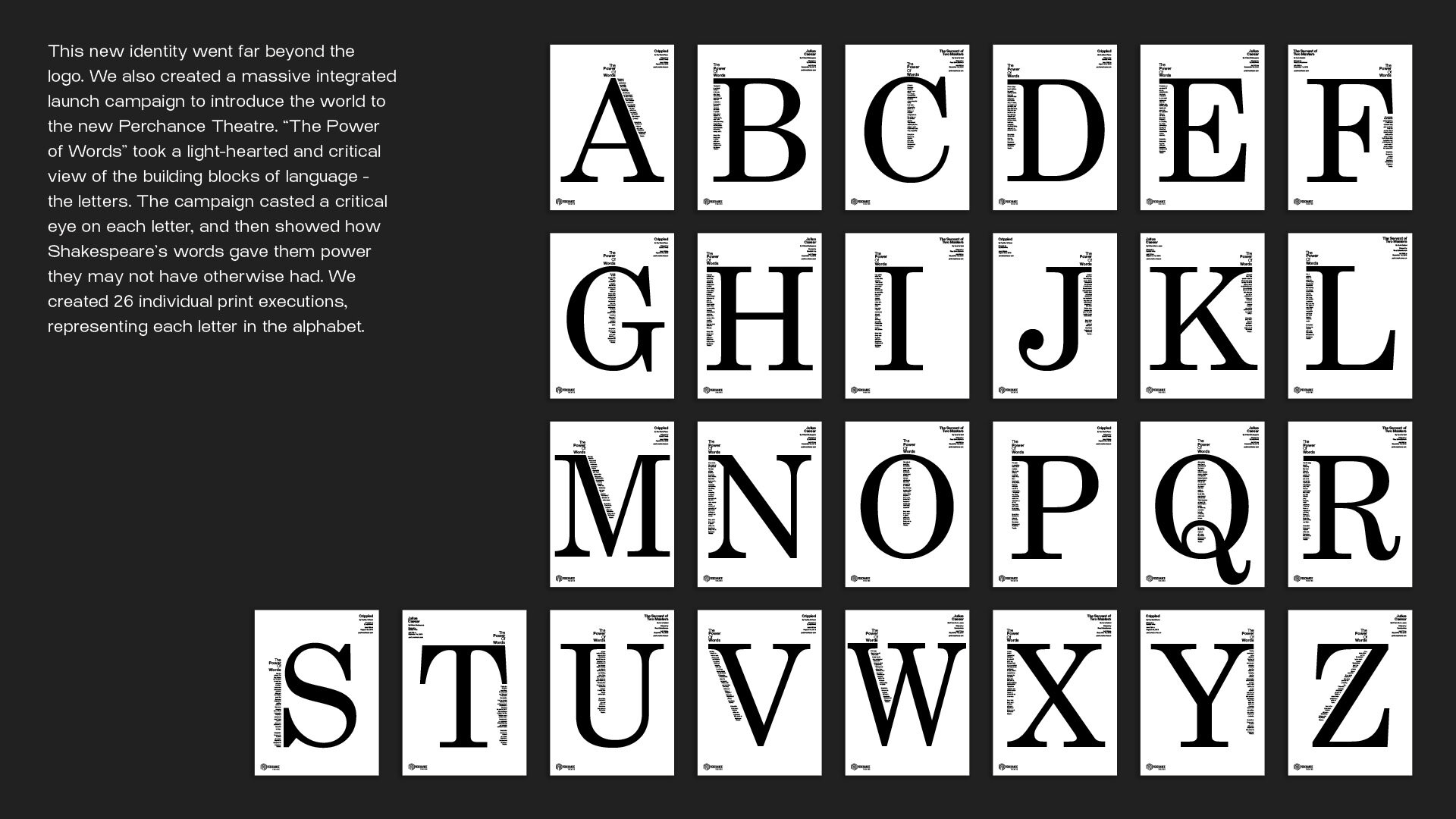
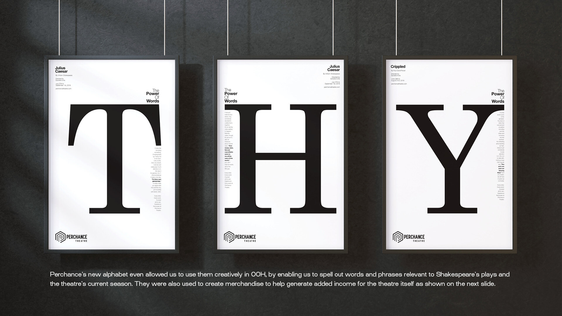
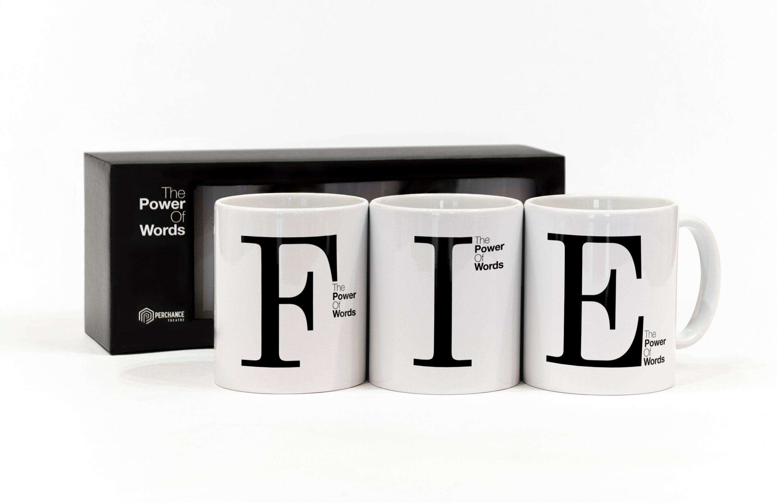
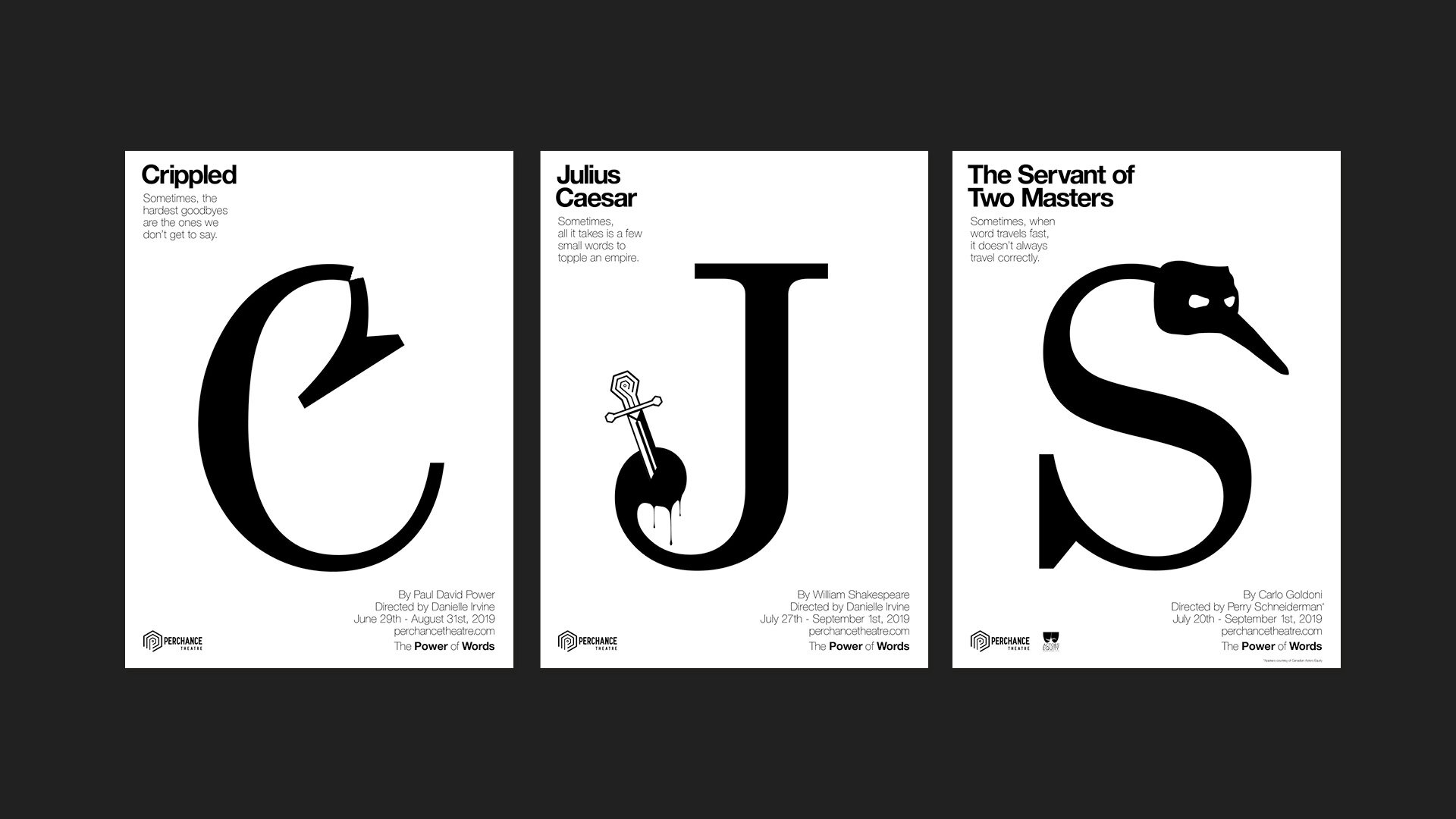
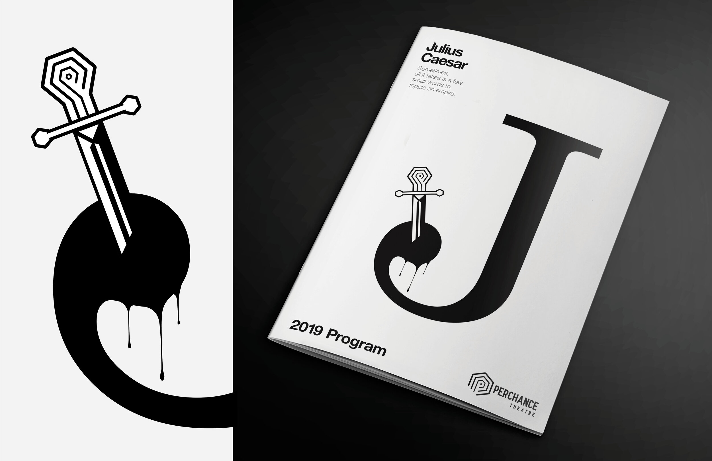
This rebrand for Perchance Theatre was designed to make the classics relevant to a new and younger audience. We started with an overhaul of the visual identity, creating a more contemporary and extremely versatile design system. The brand advertising campaign “The Power of Words” took a light hearted and critical view of the building blocks of language - the letters. On their own, letters aren’t very strong - some are just plain old weak. But, when used in the words of Shakespeare, they become powerful. Being a classical theatre, this was something Perchance could own.
